Project Scope
- Brand Identity
- Digital
- Moving image
- Packaging
- Print
Brand mark
1/3
Brand mark
2/3
Brand mark
3/3
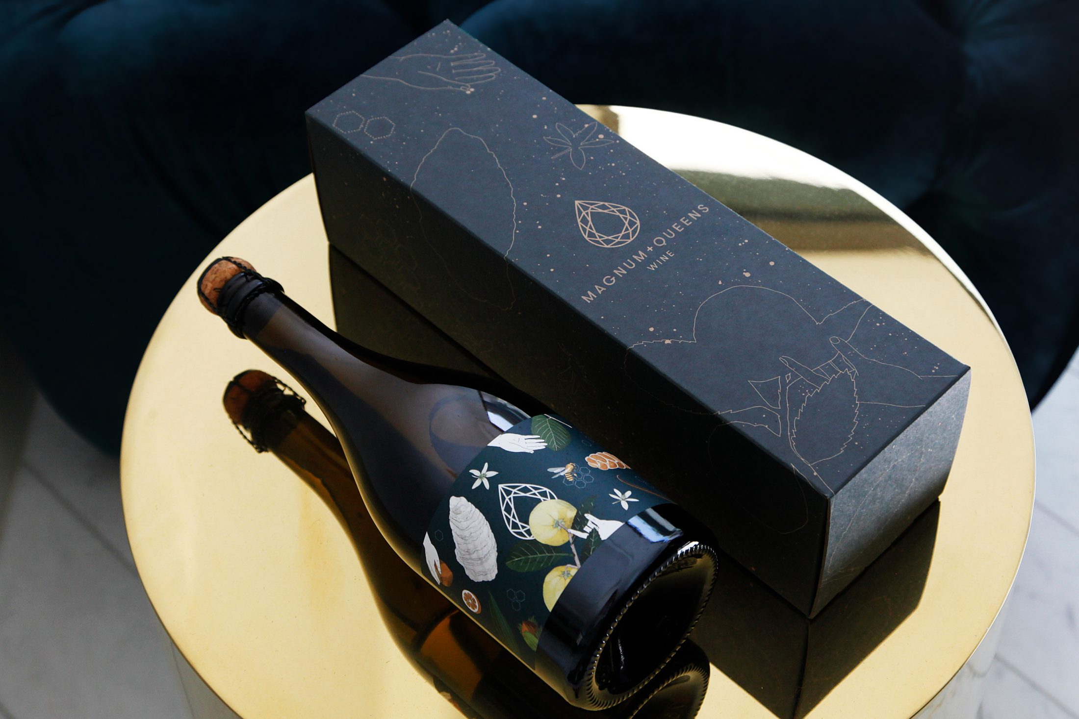
Packaging—'Fiorire' Sparkling Wine
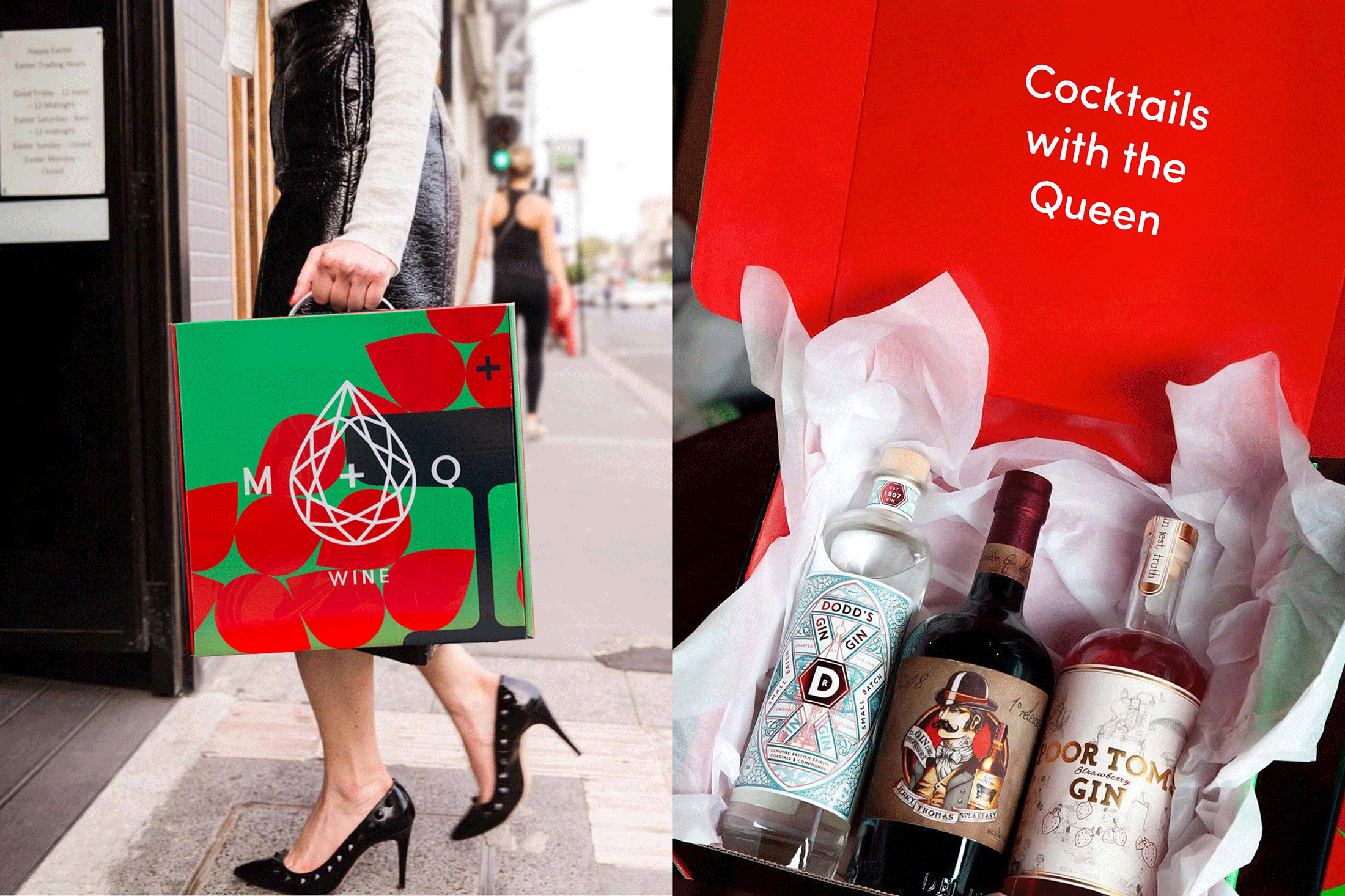
Packaging—Cocktail subscription pack
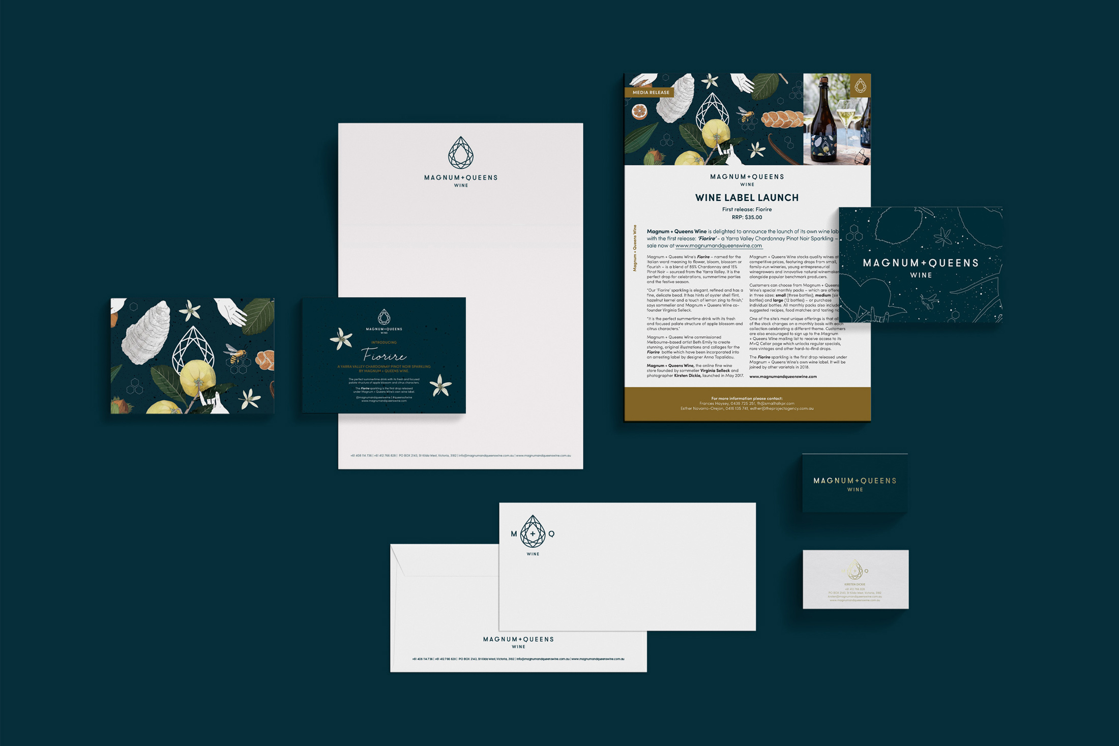
Print—Various
The full story
Intent on knocking the stuffiness—but not the stylishness—out of wine enjoyment, I was approached to develop an identity that would encapsulate the fancy-but-fun Magnum + Queens brand personality. Its focus on quality, rare and well-presented products for a wide audience needed consideration—from smart corporates to fluxing Millenials. To highlight brand attributes and create a distinct appeal to the business’ constituent markets, I designed a flexible identity with a unique visual language, making it possible to meet every touchpoint with a fitting translation. The brand mark is simultaneously composed of a faceted jewel and a sparkling wine drop—a logo mark that offers endless expressive possibilities—set above friendly geometric typography.
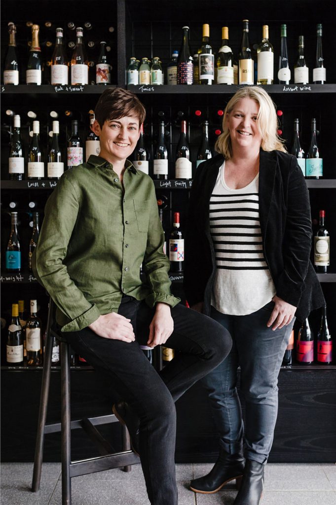
Enjoying rapid success, one year on, what was launched as an online store and subscription service, was translated into an equally well-considered physical experience. The South Melbourne store provides a chic habitat for wine lovers to explore and sample its offering of quality wines and snappy selection of spirits, beers and soft drinks.
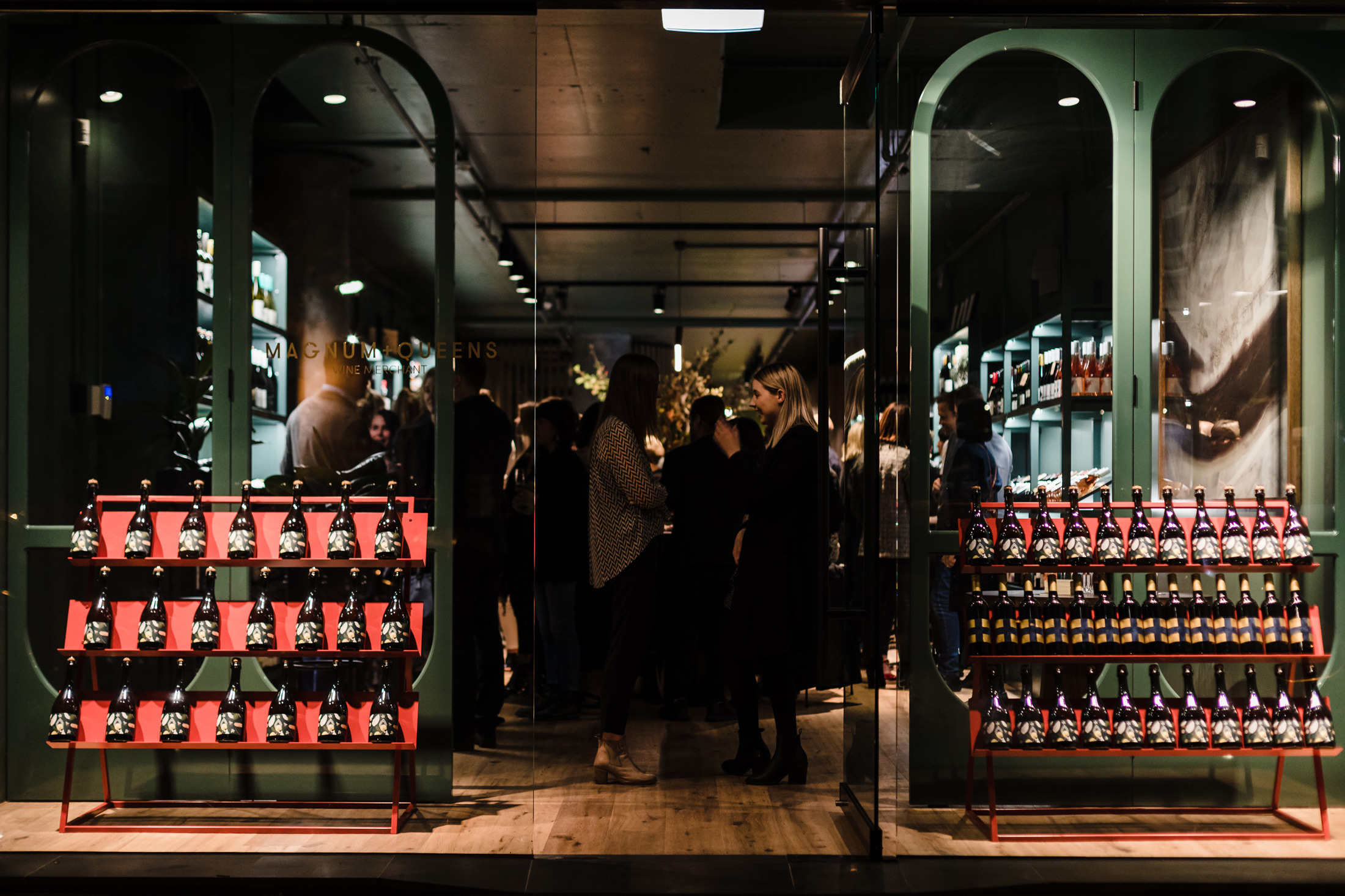
Magnum + Queens South Melbourne store
Credits
-
Amelia Stanwix
Photography
-
Kirsten Dickie
Photography