Project Scope
- Brand Identity
- Brand Strategy
- Digital
- Illustration
- Packaging
- Print
- Website
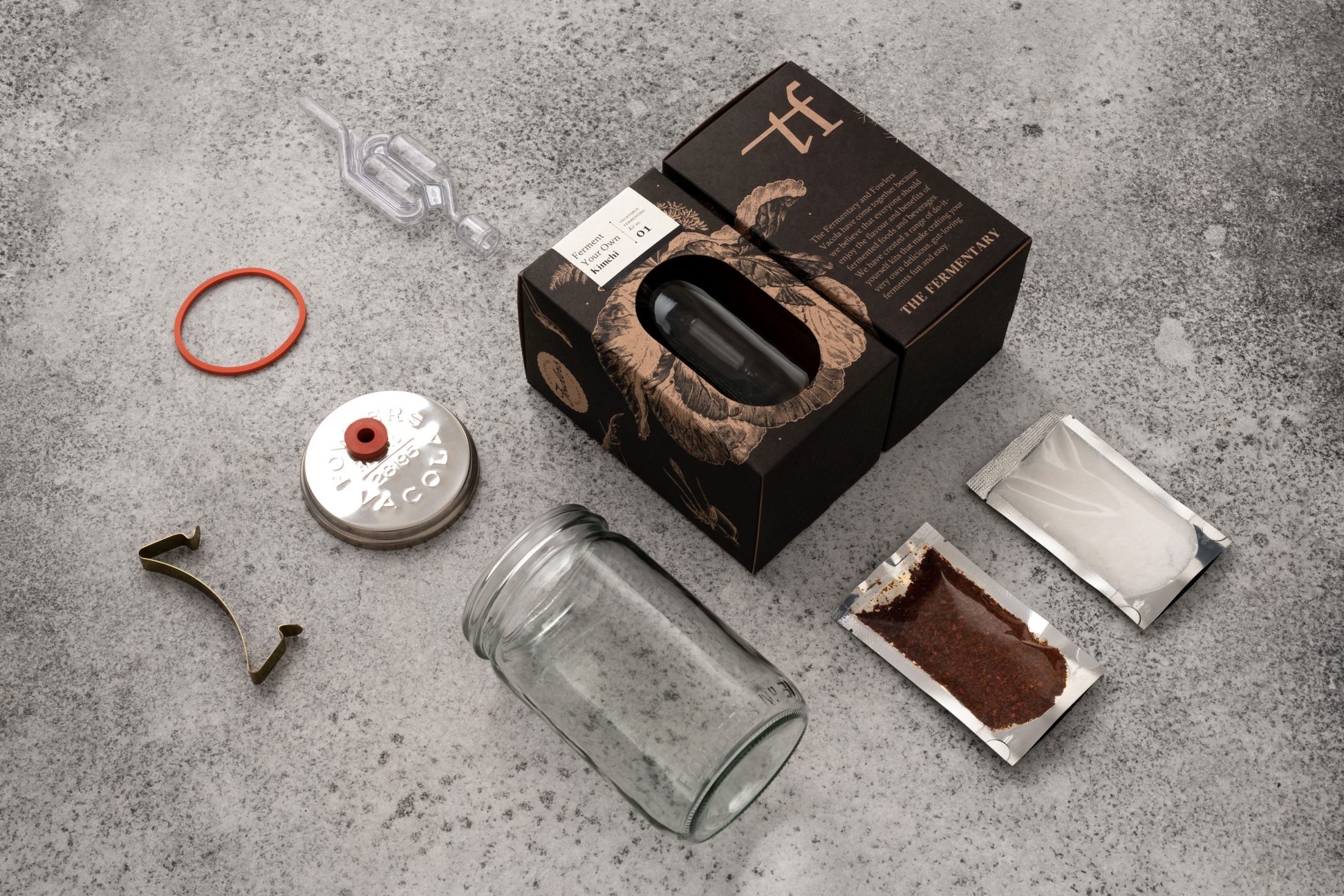
Packaging—Ferment Your Own kit
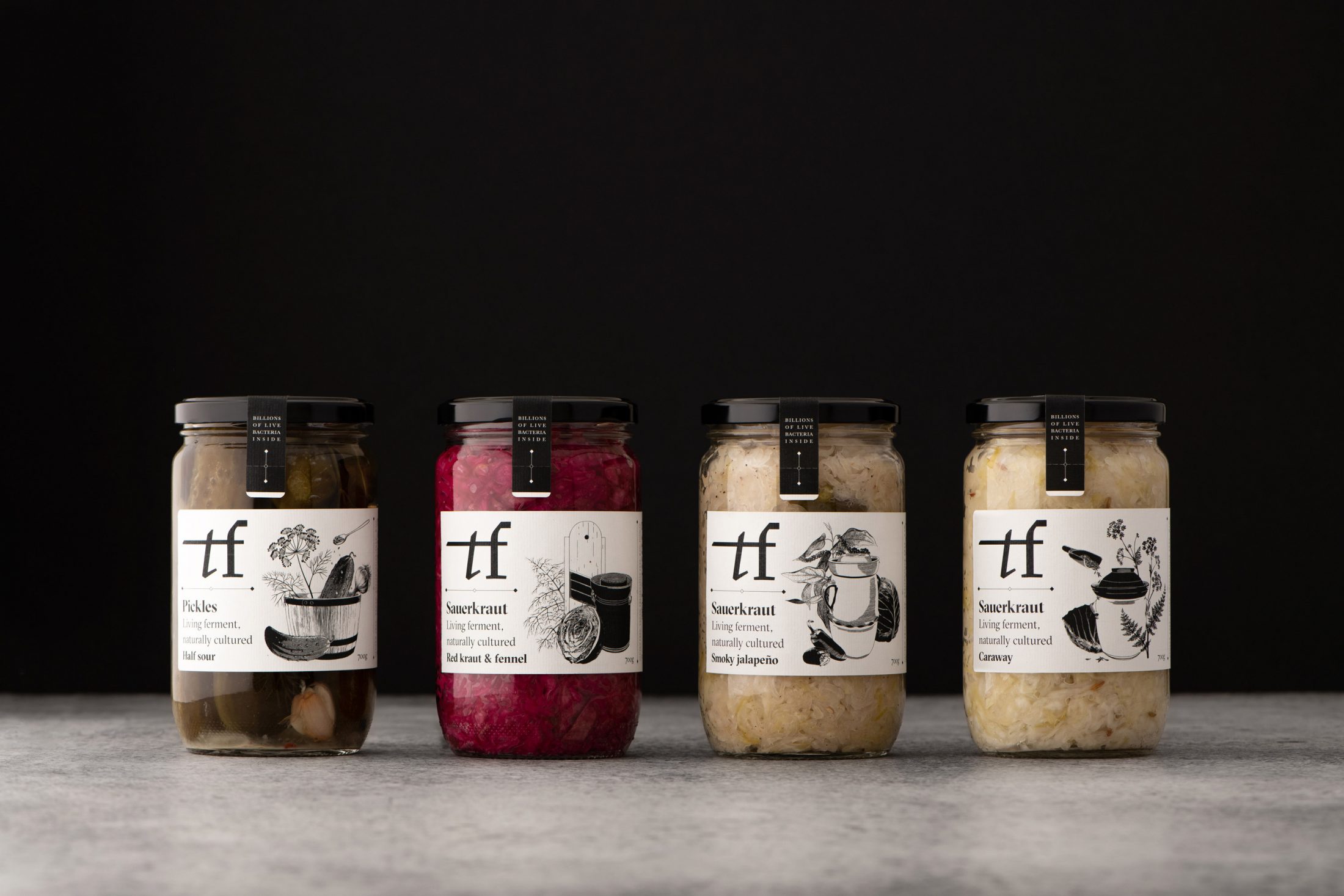
Packaging—Vegetable ferments range
1/3
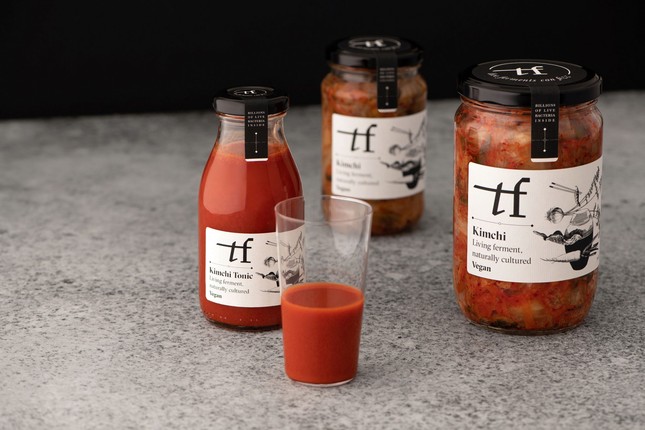
Packaging—Vegetable ferments range
2/3
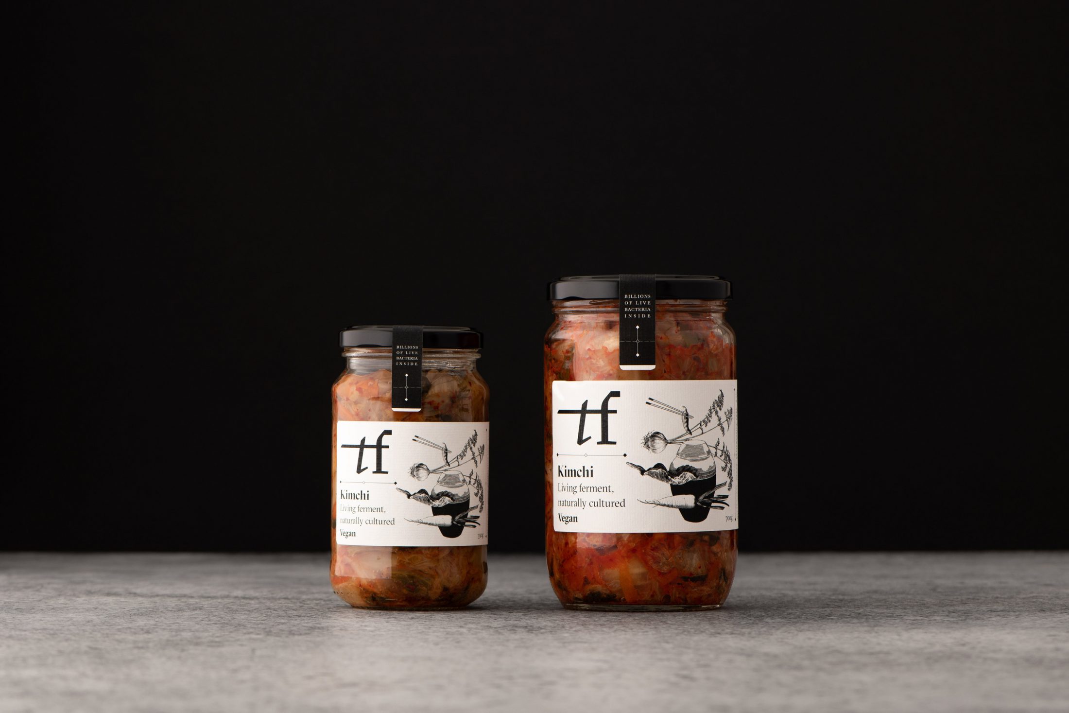
Packaging—Vegetable ferments range
3/3
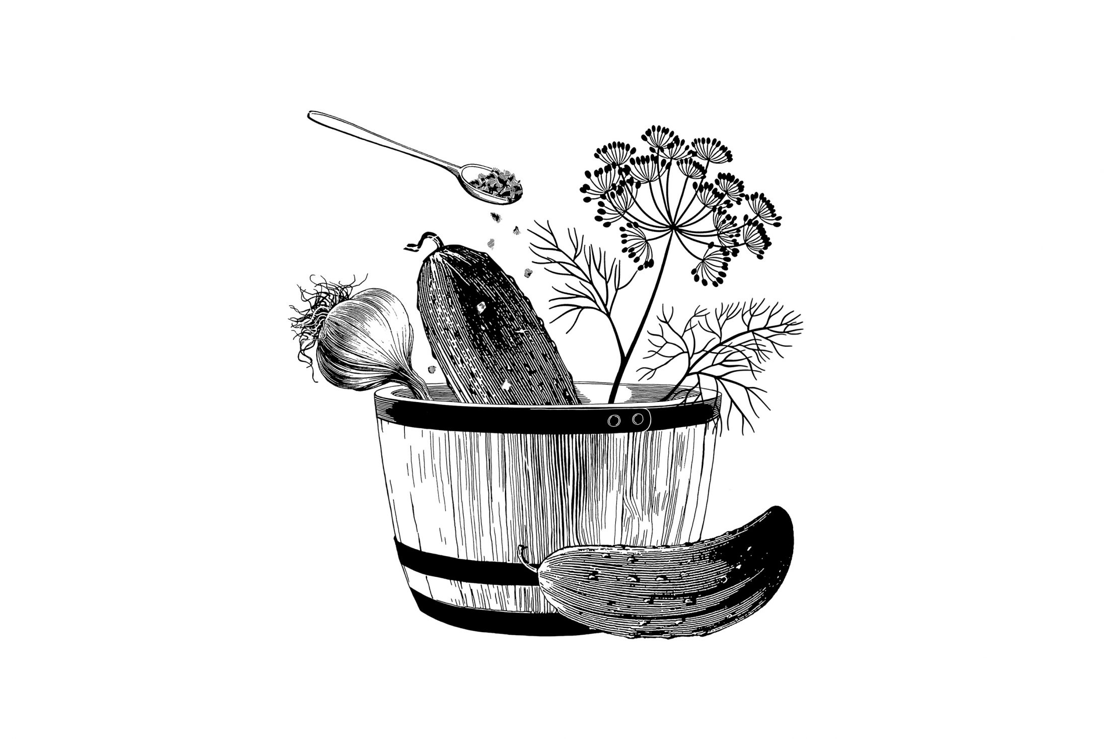
Illustration—Pickles
1/3
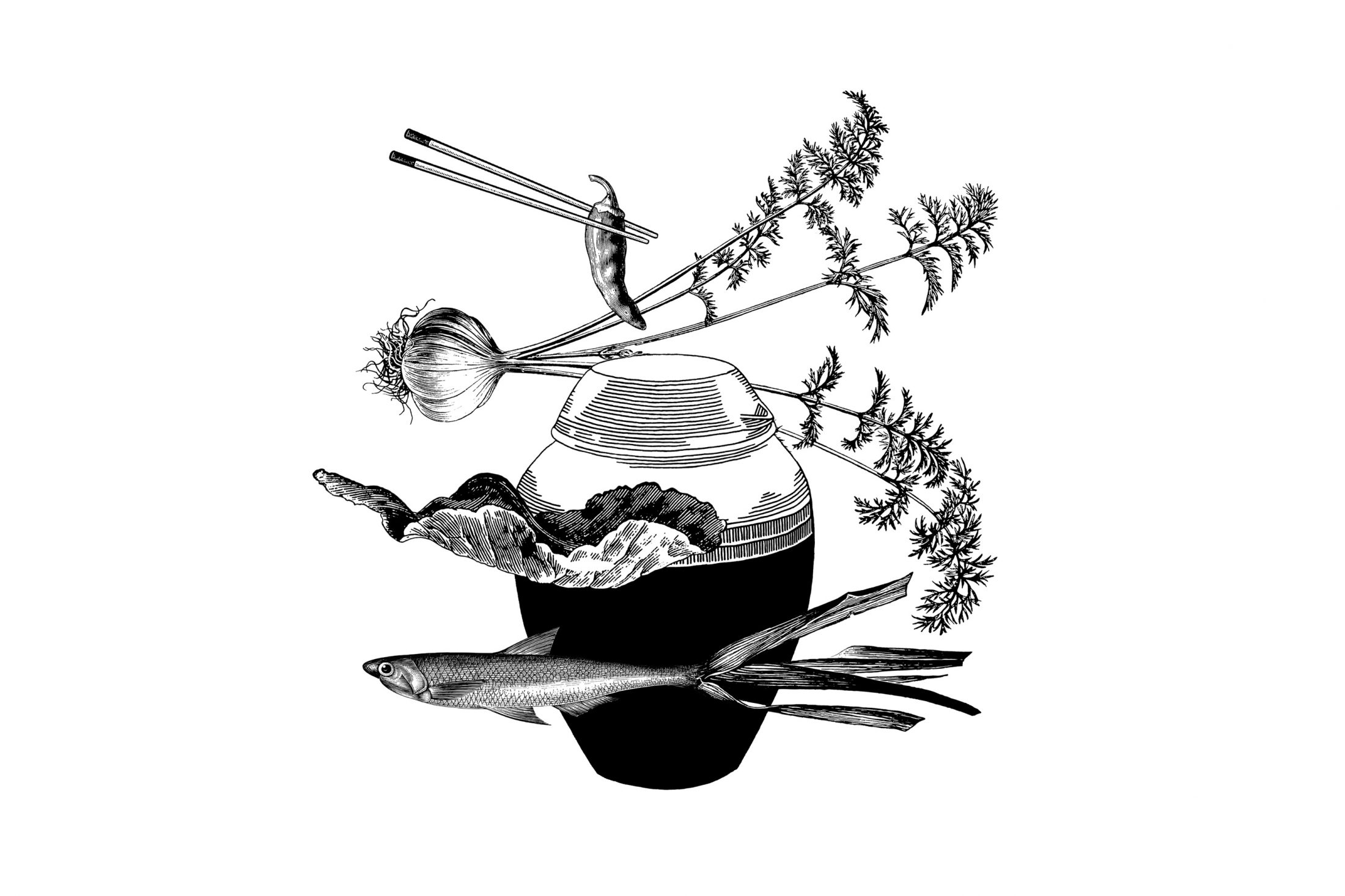
Illustration—Kimchi
2/3
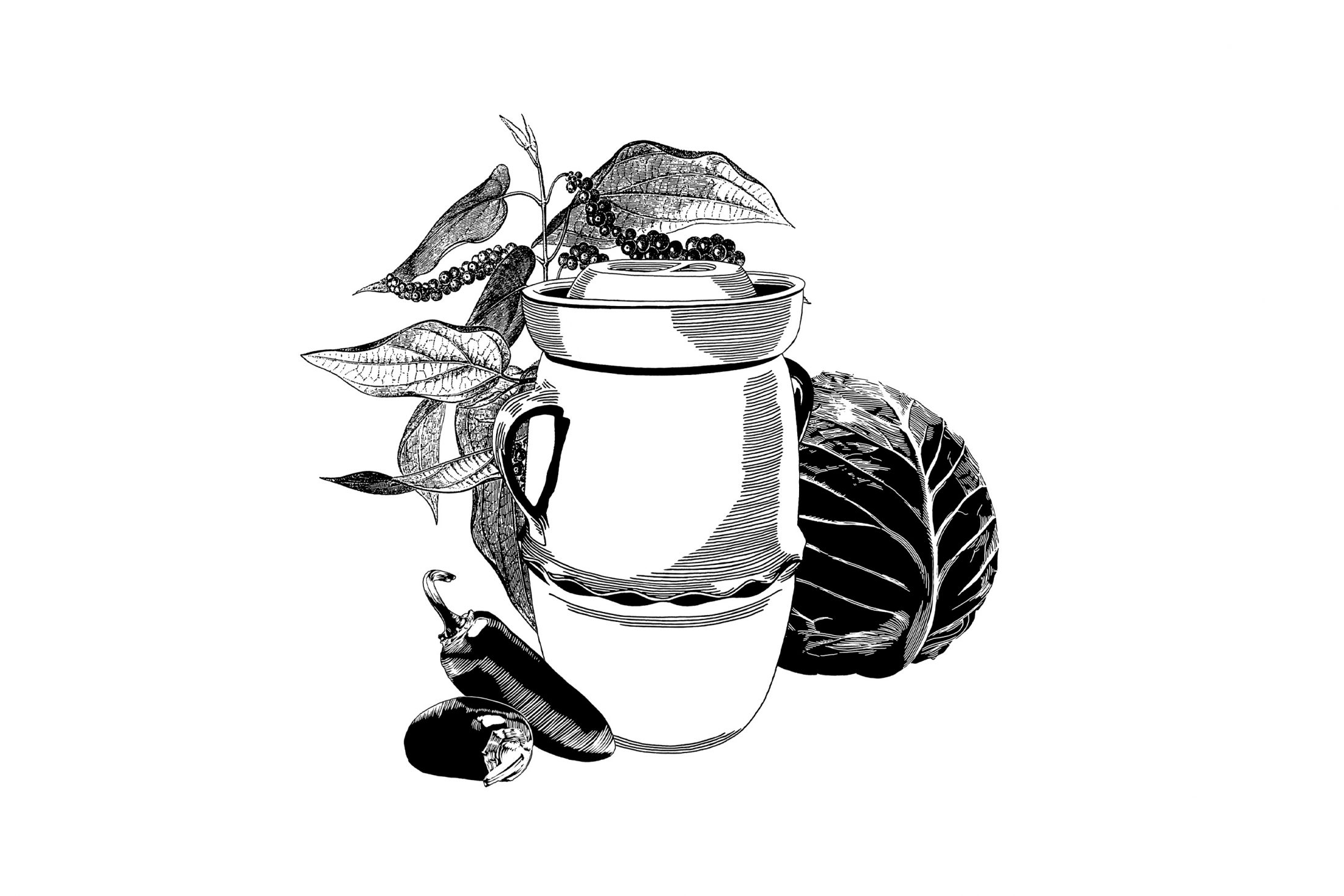
Illustration—Jalapeno kraut
3/3
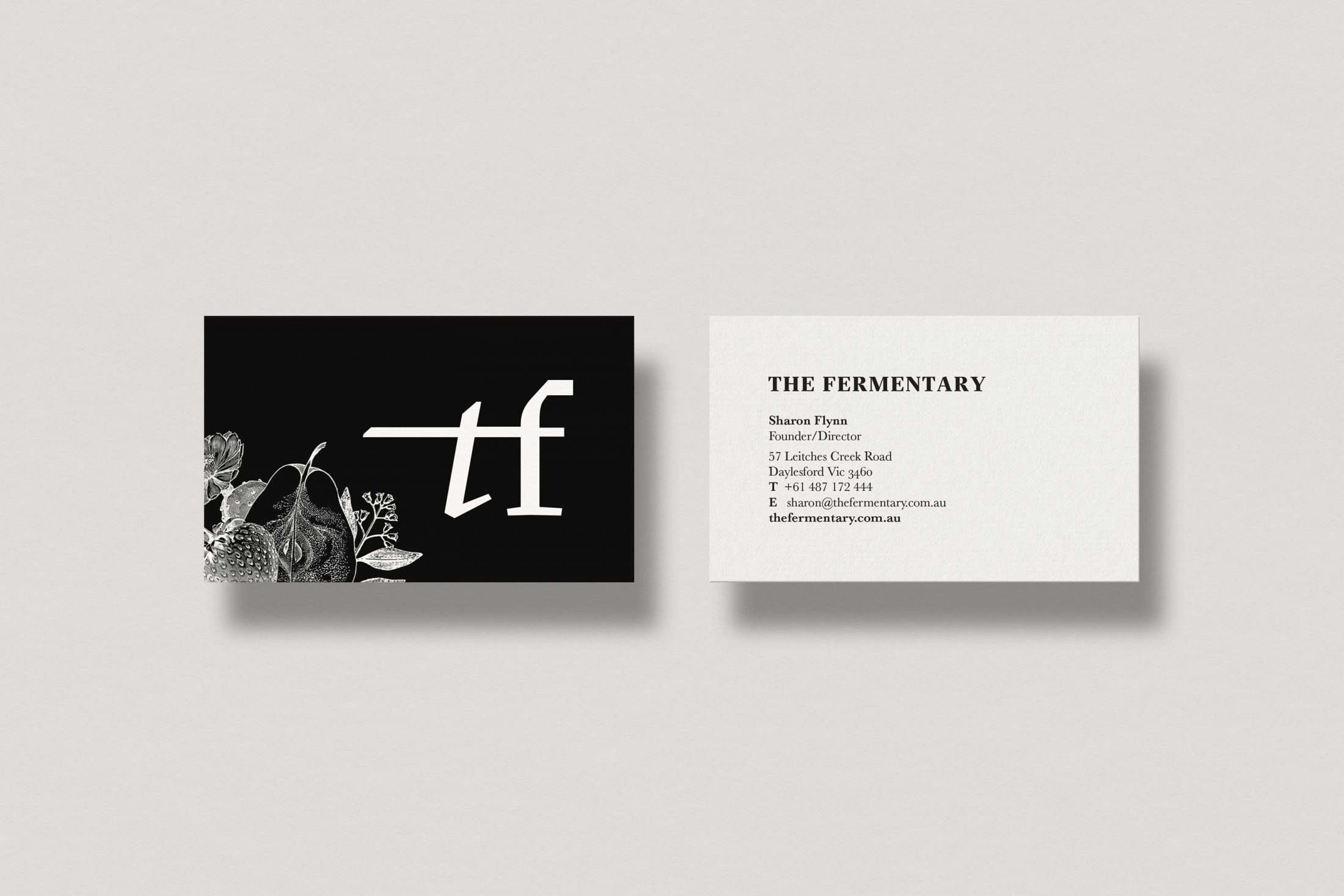
Print—Business cards
1/2
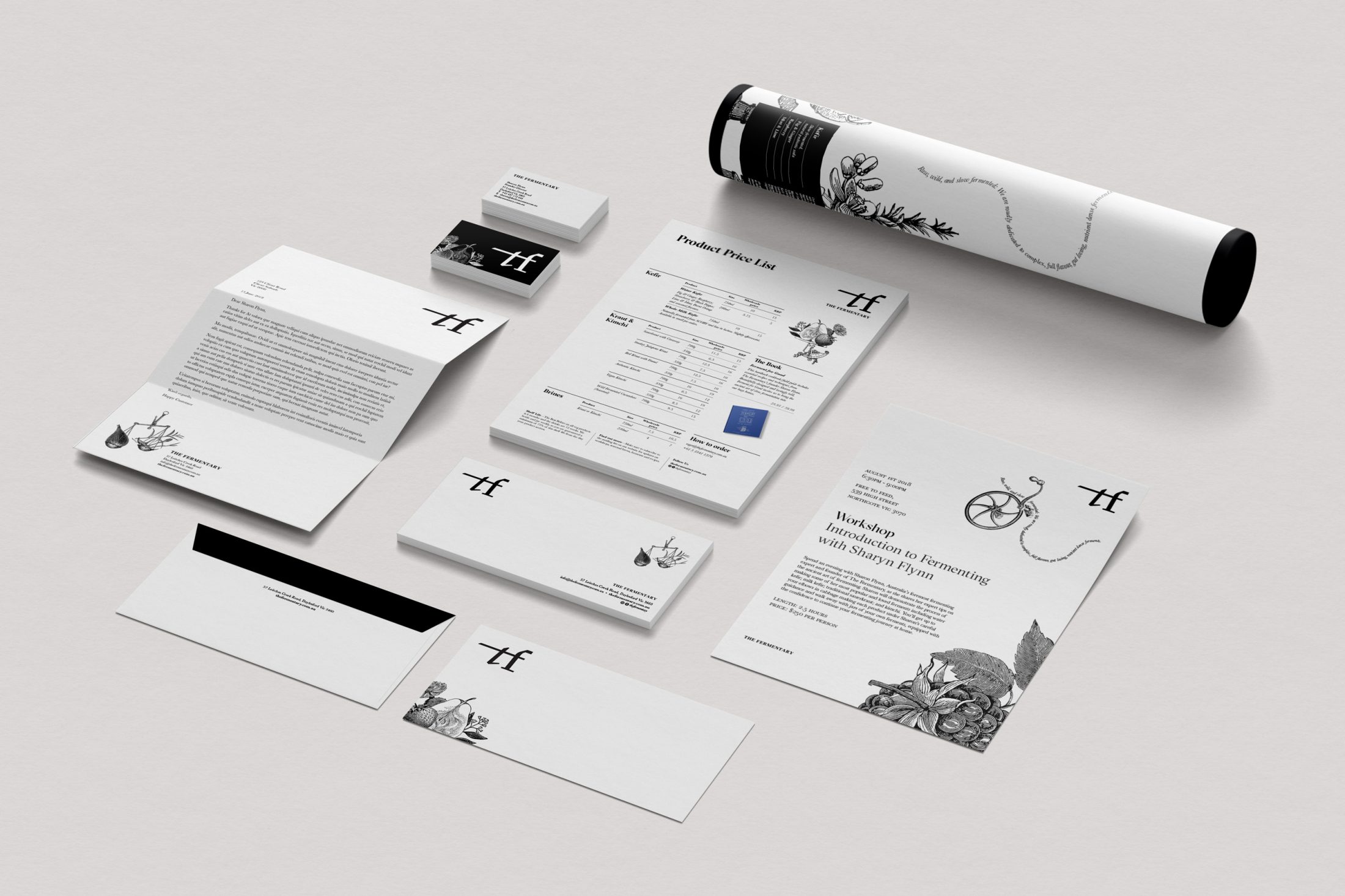
Print—Various
2/2
The full story
For the Fermentary, it’s about rewilding food. They are all too aware of the massive loss in microbial diversity that has occurred since the industrialisation of our food system. To them, microbes are companion species that are honoured by never using heat, chemicals, additives, or forced carbonation.
Led by Sharon Flynn, Australia’s foremost expert on fermentation, The Fermentary is front and centre of an exciting global fermentation revival and a growing community of wild-food seeking people.
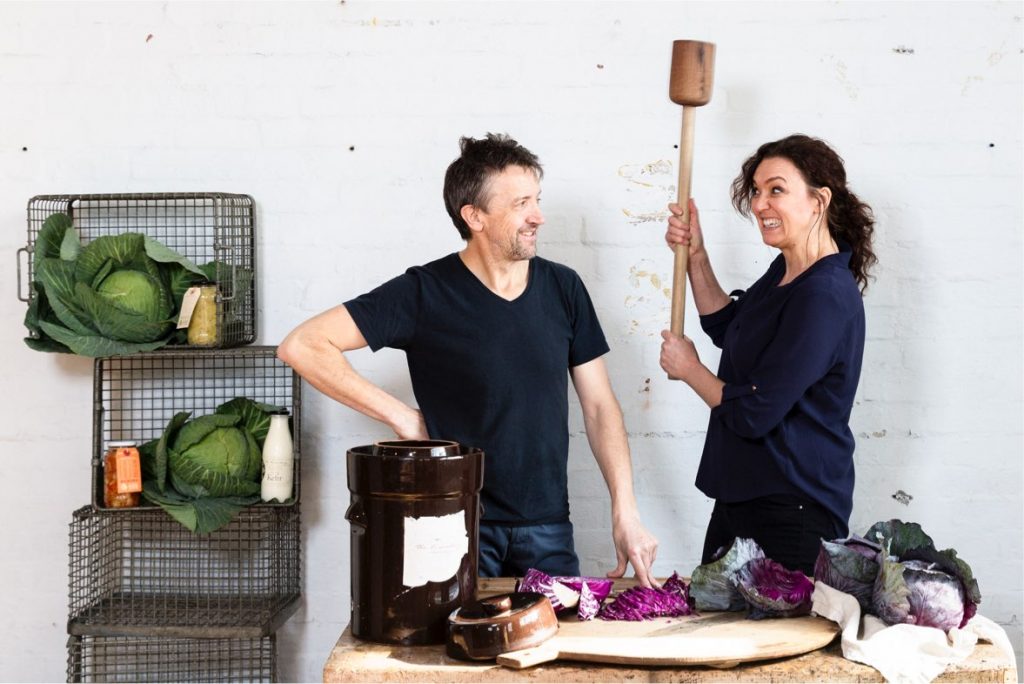
I was tasked with repositioning and retelling the brand story for a wide and diverse audience. Steering clear of health-food cliches, I created a timeless identity that intrigues, transcends fad and preserves values such as sustainability and accountability in food production.
The visual identity is informed by scientific and fermentation traditions—past and present, near and far. Line illustrations weave through stories of history, science, cultural tradition, alchemy and raw ingredients. Calligraphic and serif typography introduce the east and the west and meet an absence of colour to offset the naturally vibrant range of ferments. Printed applications are finished with laid and tactile stocks.