Project Scope
- Brand Identity
- Brand Strategy
- Illustration
- Packaging
- Print

Brandmark

Brandmark

Illustrative icon

Illustrative icons

Icon

Brand styleguide

Print—Business card

Packaging—1kg Triticale flour bag

Packaging—1kg flour range

Packaging—1kg flour range
Through environmental stewardship, holistic management and community engagement, Ian and Courtney’s vision is to support the development of regenerative farming in Australia while also cultivating a meaningful life for their family on the land. Ian and Courtney came to me seeking a strategy, visual identity, and new packaging for Woodstock Flour that would reflect this vision along with their deeply felt values.

The work I produced is encapsulated by the idea “Working with the Land” and begins by considering the fundamental idea within regenerative farming of working with the environment—not against it.
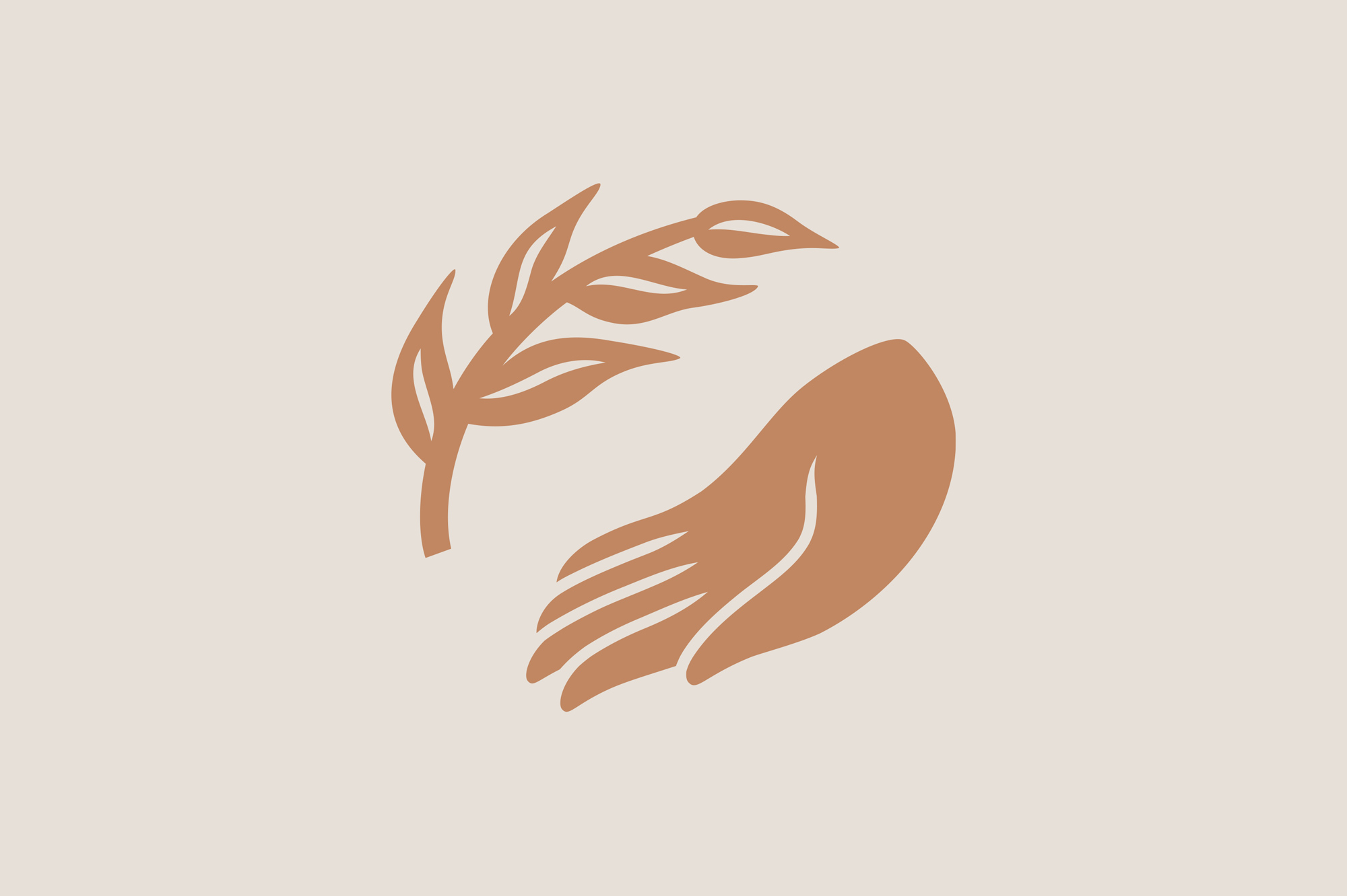
This concept is expressed in the Woodstock brandmark, which depicts a gesture of solidarity: an open human hand and a leafy branch – neither possess the other, but rather, they sit in accord. A series of illustrative icons were also created to express various key messages. The identity incorporates a friendly geometric typeface with quirky details and a contemporary typewriter typeface that adds warmth and singularity. Colours have a joyful, dusty and earthy quality, informed by Woodstock products and onsite observations.
The result is an identity with a genuine, wholesome and joyful personality that communicates the central importance of environment and community. It positions Woodstock flour as a quality, progressive producer and differentiates them from competitors through a unique and nuanced approach.
Collaborators
-
Mari Adams
Illustration
-
Rohan Trollope
Copywriting